There’s nothing like finding out you’re pregnant (with twins!) four weeks into a renovation.
“We scaled back the plan, totally,” says homeowner Manda Moore, who delivered DeLacy and
Logan just five days after moving back into their touched-up Sullivan’s Island home.
Manda’s husband owned the house—a squatty cinder block number on a prime beachfront lot—before they married, and he’d added the second story back in 1997. But the addition still felt much like a cake-
topper, a flourish on top of a plain vanilla base. Inside, the ground floor of the reverse-floor plan home remained a seldom-used 1950s remnant—choppy, claustrophobic, and slightly depressing. But instead of a major overhaul, their 2005 “gestation” renovation was scaled back to some basics—a minor kitchen re-do, closing in a sun porch, retiling bathrooms, and adding heart-pine floors. The intensive work would have to wait.
In the long run, the delay proved beneficial. Chasing twin toddlers around the house for the next few years, plus welcoming her husband’s two older children from a previous marriage (Katie, 20, and Matt, 18), gave Manda a clearer picture of how the house did—and didn’t—work for their active family. “We never went downstairs,” Manda recalls. “I wanted to be able to use every square foot of my house, and now, I can honestly say that we do.”
Four years after the second go-round, she brought in architectural designer Beau Clowney, Brown-Meihaus Construction, and interior designer LuAnn McCants—with lighting help from brother Sam Moore, who owns Mount Pleasant’s Candelabra—to help give shape and form, color and texture to her vision. The goal was to capitalize on the ocean views and create a functional simplicity and openness with a feel of refined comfort. “This is our home, not a vacation house, so I didn’t want it too beachy casual, but I also didn’t want to worry about anyone spilling anything. Kids need to be able to run around and be kids,” says Manda.
Once the renovation began, they discovered that much of the earlier 1997 work was sub-par and had to be gutted. “We started with the first floor and worked our way up,” says LuAnn. They took the classic Sullivan’s Island pine plank walls down to the studs (the wood was damaged and had to be removed), and used horizontal white shiplap to give a cozy coastal feel. The twins got small his-and-her bedrooms on either side of an adjoining Jack-and-Jill bathroom, while Matt, who lives there full-time while he’s still in high school, commandeers a cozy corner bedroom.
In the first-floor living area, indentations of original windows (long ago filled in by a previous owner) turned into art nooks.
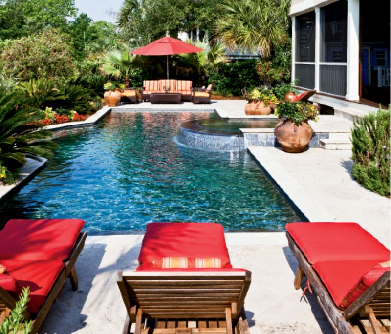
LuAnn commissioned local artist Curtis Phillips to fill them with iconic Sullivan’s scenes, one of the lighthouse just a block away and one of the Island Club—a favorite Moore family hangout on Friday evenings. French doors lead out to a wide screened porch with big sliding barn doors that open to the pool.
“I learned a lot from the previous renovation,” says Manda. “There was this sense of urgency to finish before the kids were born, so when something was questionable I’d say, ‘Oh just leave it, it’s fine.’ This time I made sure to get things right.” Nowhere is her think-through-everything brilliance more evident than in the kitchen. They bumped out the exterior west wall to create a large new cook space and butler’s pantry, complete with an elevator to the ground floor (in anticipation of aging parents and mighty handy when unloading groceries!). The addition allowed room for a pair of island work centers—a butcher block for food prep and a separate island for family gathering and entertaining.
“Here, I love this,” says Manda, pulling out the kids’ drink station, a refrigerated drawer stocked with water and juice. “They can grab what they need without getting underfoot while I’m cooking.” And her absolute favorite touch? (Besides the gleaming brushed nickel farm sink—a pièce de résistance handcrafted by a Texas artisan.) “The trash shoot.” Open a drawer in the butler’s pantry, toss in the trash, and bingo, down it goes, directly to the bin. “My husband loves it. He never has to take out the garbage.” Other carefully thought-out details, such as a dedicated charging station for multiple technology tangles (iPods, cell phones,iPads, etc.) hidden neatly inside a cabinet and outlets tucked out of view underneath the upper cabinets, add to the streamlined, clutter-free atmosphere.
“Sometimes you walk into a house and ask yourself, ‘What is it that makes this space click?’ Here, it’s having less,” LuAnn notes.
“We wanted to reduce what I call ‘visual noise.’” The main living area upstairs is a haven of hushed sophistication. Neutral tones are cool and calming, and luxurious textures—linen, mohair, velvet—give a sense of warmth and ooh-la-la. The palette is straight from the surrounding landscape—kitchen cabinets the color of a silvery stormy sky, the Calcutta Gold marble hinting at sand and sea foam, the color of the sink cabinet in the kids’ bathroom copied from a palmetto trunk in the yard.
“They knew what they were doing when they first situated this house on the lot,” says Manda, gliding open the big sliding doors that extend the family room out onto the oceanfront porch. “It’s nice and shady out here all summer and warm and sunny all winter.” And it’s clear that she and her team knew what they were doing, too, when transforming an old cinder block beach house into a comfy, classy, island-inspired home. Whether it’s adorable twins or back-to-back renovations—it seems good things come in twos.