


Scott Salvator is accustomed to grand. The tax attorney-turned-New York designer has a client roster that not only includes Manhattan and New England’s most well-heeled, but also the Carlyle (he redid Café Carlyle) and the Blair House (he assisted in revamping the President’s official state guest house). His work and name regularly appear on the pages of the biggies—Architectural Digest, House Beautiful, and The New York Times—and he’s so sweeping and devil-may-care in both style and speech that he’s the A-list design press’s go-to gent for quotes.
So what was Salvator doing here in Charleston in a less than 2,000-square-foot dependency? Giving it his signature—fresh life via vivid pattern, color, and texture—for a client, of course. “I took the job because it was fun and in a different location,” says Salvator, who met the home’s bachelor-owner during a consultation on his Big Apple office space (Salvator later redid the executive’s loft there as well). When the client bought the Charleston residence, which sits in the shadow of his mother’s place South of Broad, Salvator was asked once more to come aboard.
He teamed up with BAR member Eddie Fava of e. e. fava architects (a Guggenheim fellow whose past projects have included Historic Charleston Foundation’s Missroon House and Spoleto’s headquarters) and contractor Harper “Happy” Finucan. Within a year, the trio had transformed the cottage from the house flipper’s curse—a home neutral within an inch of its life so it can sell easily—into a vibrant collage of colors, ranging from apple green to deep red, smoldering purple to tangerine. And while the architect admits that his experience and proclivities have long been toward a more mellow palette and décor, working with Salvator ignited a minor revolution in him.
“Restraint,” Fava says, “was not really an option with this house, this client, or this team. No one down here is picking these colors, so my eyes were opened to a whole new energy. I came from a perspective of too much color! too much furniture! and now after a double take—make that a triple take—it’s shown me that trying other things can work. Plus,” he adds with a semi-
surprised grin, “it was fun being able to play.”
The team started from a premise of honesty. “This house was never formal,” says Salvator. “It’s a little dependency house, so fine, let it be what it was meant to be. We’re just here to dress it up a bit.” Next, they considered how the homeowner intended to use the place—as a getaway mostly during Spoleto and the summer, with room for a guest and space to have cocktails before heading out for dinner downtown. Then they took the man’s loves—color, artwork, and comfort—to heart.
From there, Fava and Finucan tackled upkeep and layout issues. The kitchen floor demanded reshoring, and the brickwork needed repointing. The galley kitchen scored a string of French doors that open onto the owner’s mother’s courtyard as well as the property’s own tiny garden; breakfast-slash-bar area shelves were redone in glass; and the partition wall between the dining area and kitchen was expanded to screen cooking and dishwashing utilities. Once the bones were in place, Salvator got to adding “lipstick and makeup”—i.e., paint, color, and furniture.
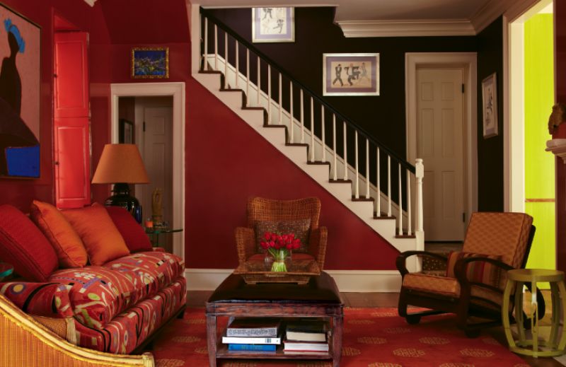
To that end, thanks to a smart sofa, chair, and rug configuration downstairs, the living room morphed into two parlors. Ten layers of red paint gave its walls a high-sheen lacquer, while striated apple green in the adjoining bar-dining area amplified the light therein. Add a patterned wood floor in the kitchen-dining area, and textures and pattern create flow throughout the first floor.
Because Salvator believes “dark rooms don’t get lighter and light rooms don’t get darker,” the honesty policy extended to the stairwell, where deep purple—inspired by vintage prints from Julia Santen Gallery—envelops the walls. To continue the pattern play, a swank antelope-print carpet blankets stairs that lead up to the bedrooms. In the guest quarters, the team opted for the homeowner’s idea of upholstered, rather than wallpapered, walls.
All in all, the results speak for themselves. “It’s a nod to traditional styles and color pairings,” says Salvator. “But we’ve added a contemporary twist that tells you a younger person lives here—and that it’s 2011.” A grand concept and execution, indeed.